Partnered was a Y Combinator startup that connected big brands with popular startups for brand sponsorships. The idea was an interesting and unique one — treat startups like a new type of advertising channel — but when I joined, the UX was confusing and the visual design didn’t look worth paying for.
The initial prototype had signups but no repeat engagement.
At the time, they had accounts from very influential companies that would check it out without sticking around, showing that they had an interesting value proposition but the product wasn’t fulfilling expectations.

Phase 1
A quick redesign to relaunch at SXSW
Phase 2
Long term user research to target larger customers
Immediately after joining, my first priority was to overhaul the free prototype and relaunch it as a paid product at SXSW, since we knew that would be the perfect target audience for growth hackers looking to network with VIP marketers.
The team cranked in an all-out 3 week sprint to redesign the app from top to bottom. We threw away the previous design, refocused the app on features that were unique to the network and gave the visual design a fresh new coat of paint.

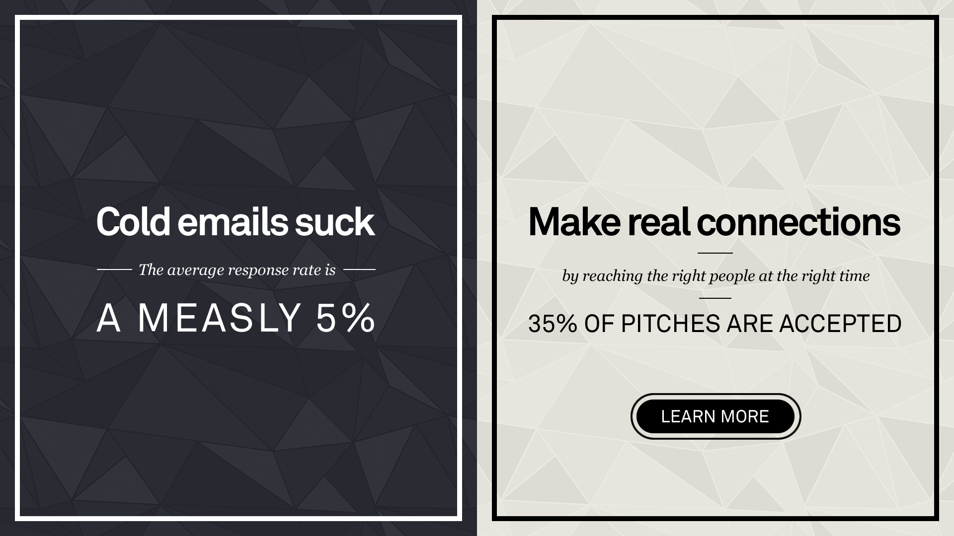
Nailing down the value prop — the app vastly outperformed typical email intros.
In Austin, we hosted our own event with panelists from our user base and I gave product demos to VIP guests that we targeted in advance.
The relaunch was a success and we had our first paid customers shortly after returning from SXSW.
After the relaunch, I did user research with our initial customers to see how we could expand our user base from single seat customers to larger teams.
Sure enough, after a ton of conversations and brainstorming with our target customers, we eventually found the way to make Partnered worth paying for: catering to teams in advertising agencies and creating a vendor database to help track complicated customer relationships.
Feature development is a different kind of slow burn, compared to the rapid firefighter work of a redesign.
Coming up with and testing new features is second nature to me — a patient and iterative process that I’ve done many times before. I’m in my sweet spot when I’m regularly meeting with a small base of enthusiastic early adopters and cycling through experiments until we find the features that take off with a larger audience.

My formula for making things people want
This project was an important business milestone for me. It was immensely satisfying to use the power of design to make something that business users clearly understood and found worth paying for.
After all of my years of experience, this was my first time being responsible for landing the initial customers.
Every B2B company I worked at before Partnered already had customers but this was my baby, all the way from rough prototype to the initial dollars coming in through the door. And it felt great to come through.
