Circle Medical is a new kind of full-service medical practice that uses technology to deliver better patient experiences and outcomes at a lower cost.
This project hit all of the major elements of design work: user research, UX streamlining, and UI polish.
The goal was to improve account creation and a patient’s first office visit. Decreasing any frustrating or time-intensive paperwork should increase the quality of interaction with doctors, aiding both diagnosis and relationship-building.
I had the privilege of working alongside a design founder who was just as passionate about user research as I was. We recorded and analyzed interviews with almost everyone at the company, revealing several common pain points.
The fun part is turning conversations into pixels—boiling down all those discussions into product insights and translating them into new designs.
I started my career as a frontend developer and still enjoy working directly with engineers, so I often triage my solutions into two buckets to give them options:
With that in mind, I designed these two flows for Circle Medical’s check-in process:
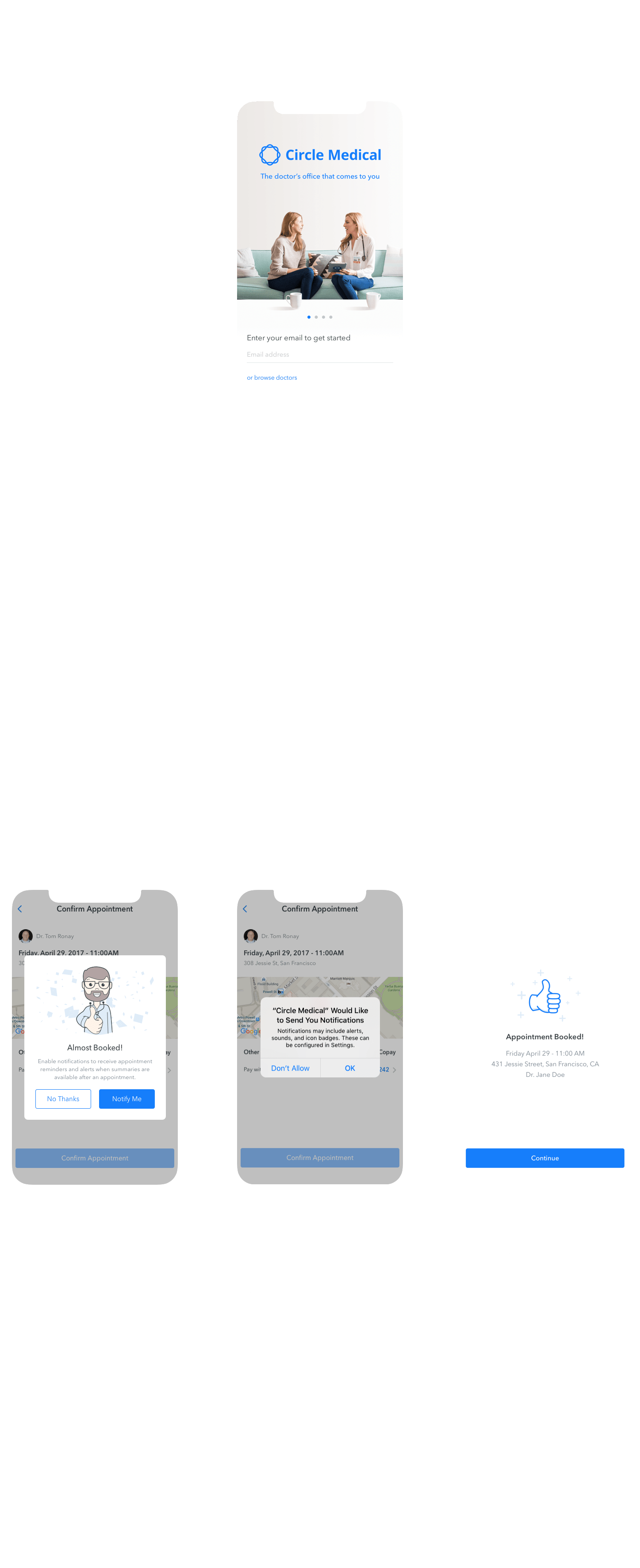
The second flow places even more emphasis on push notifications and ends with a friendly screen to help with wayfinding to the office.

That last screen is worth highlighting because it sets such a strong tone for a patient’s first visit, demonstrating how user insights drove design at every level.
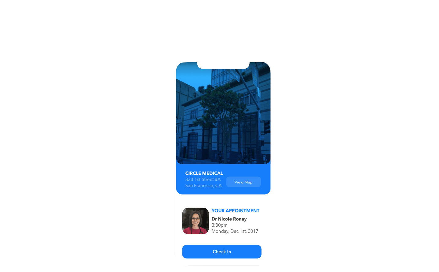
Language and visual design are invaluable tools for subconsciously communicating product quality and values. The initial aesthetics frame the rest of the experience by setting expectations.
First impressions impact overall usability and perceived utility.
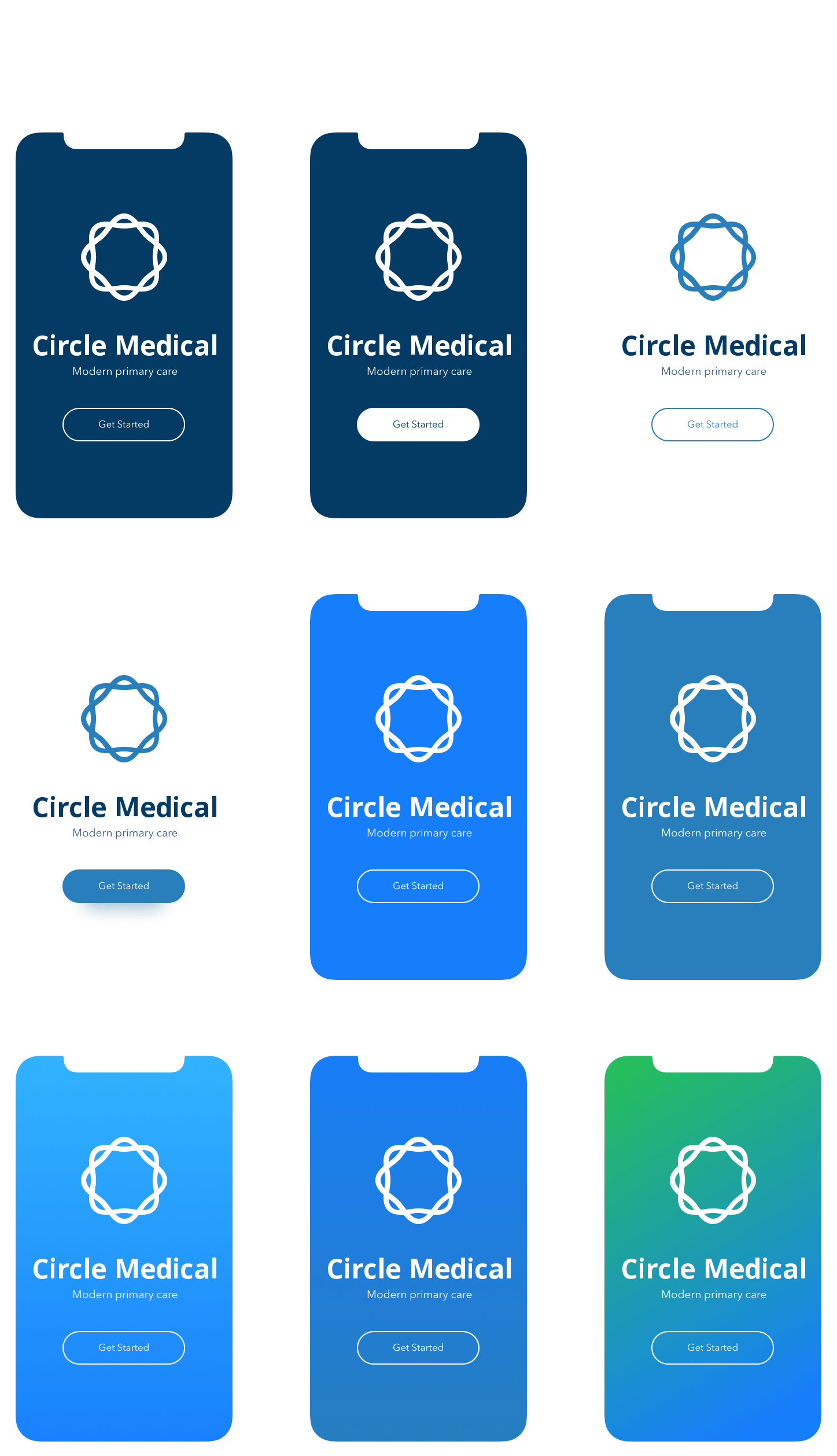
In addition to the check-in UX, I focused on the initial landing screens and experimented with a range of complementary visual styles: photographic, illustrative, and colorful.
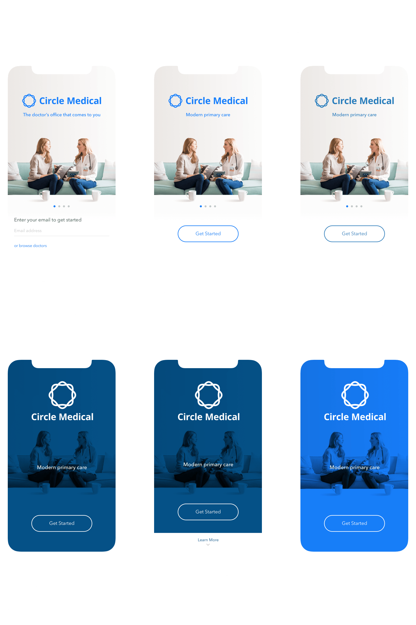
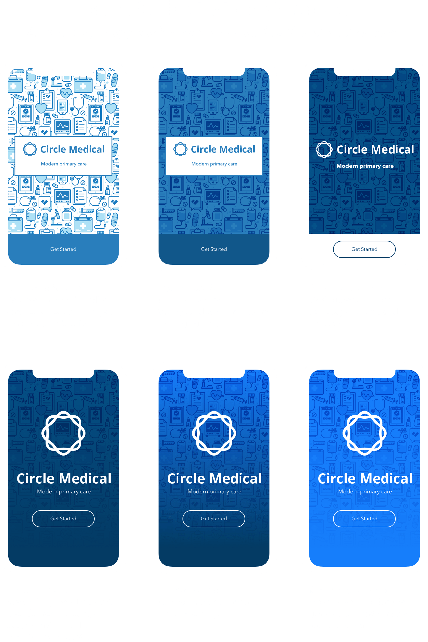
I really enjoyed working on this project! The team at Circle Medical takes great pride in the care provided by their doctors and medical staff. They see patient engagement as a key differentiator among the startups reinventing primary care.
These values influenced me greatly and carried through into the end product in this case study.
Thanks for making it this far! Feel free to email me if you have any questions.
