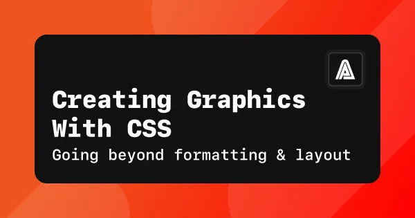
I was tinkering with my website recently when I had an idea for an effect on the home page, one that cleaned up the convoluted text in the main headlines:
(screenshot of before and after, maybe use srcset for mobile?)
I was about to resort to my decades-old tried and true methods when a little light bulb flickered that there might be a better way. For a few months now, Joe has been doing illustration challenges on CSSBattle.dev, an online puzzle game for developers where you solve daily challenges to replicate target images using the shortest possible amount of CSS.
I’ve been following along with his progress and he’s really leveled up in such a short time. I mean check out this sick casette tape:
(image of casette tape (with link to codepen?))
That’s just a stunning level of detail. Check it out on codepen to see it with animated sprockets.
Joe’s recent experiments have really expanded my mind as to what could be done with CSS without resorting to either images or SVG’s, so I thought my little project would be a good starting point to learn a few of his techniques and take a peak into his toolbox.
On a lark, I pinged Joe on a Saturday afternoon to see if he could help and to my delight, he graciously took almost two solid hours on a zoom call to not just hand me the final effect but to also make sure that I understood the underling concepts, like a live tutorial.
(break up preceding paragraph with a screenshot of text message?)
First he walked me through a much more complex example of a daily challenge on CSSBattle to show me how he works through the problem and how flexible a few basic techniques can be, then applied those concepts to my revised home page graphic.
It was an amazing one man masterclass session. So to pay it forward, I’m going to break down the concepts and document them here.
Let’s start in reverse order from the call on Saturday - we’re going to look at my simpler graphic first and then build from there to a harder problem from CSSBattle.
The Problem
First off, let’s walk through what the intended effect is for the final graphic.
- All of the words and the ampersand between the two lines should be HTML so it can get the default benefits of native text:
- Easy to update
- Scales up and down really crisply
- Dark and light modes are stupid simple
- Supafast download, which is especially important above the fold of a home page of a design portfolio that’s already image-heavy. Any kind of delayed pop of loading a graphic doesn’t make for a professional first impression.
- The words on the first and third lines should be left-aligned
- The ampersand should be horizontally-centered to the largest line of text (the first one)
- The thick horizontal dividers should be fully justified left and right to the largest line of text (again the first one)
- The dividers should stay proportionally the same to the ampersand no matter how large or small the text is resized, roughly equivalent to the thickness of the descenders of the capital letters like D.
The Old Solutions
How can we go about this without CSS illustrations? If you’ve been around the web for a while, maybe some of your usual tried-and-true techniques are the same as mine: inline images, SVG’s, or CSS background images.
The thing is that these legacy methods all have drawbacks:
-
Creating an
<IMG>for the whole thing would solve the justification issues, but if we want to put text in an image that still looks crisp without fuzzy or jaggy artifacts that give it away (our eyes are super attuned to the minor details in text compared to other graphics, much like they are with human faces compared to other species) then that means making a bunch of variants for different resolutions, plus dark and light modes for each, and using a combination of<SRCSET>and media queries to flip through them all.Too much work, no thanks 👎
-
Making an SVG would scale the dividers crisply but it doesn’t deal with text very well, at least not at reasonable file sizes. Vector graphics are great for more plain geometric shapes like charts, or for loopy abstract graphics like at the top of one of my design case studies, but I can’t afford to mess up the very first words on my portfolio site with SVG’s.
Total non-starter 🙅🏻
-
Then there’s the good ‘ol reliable CSS background images. This technique is like Grandpa Al’s Trusty Swiss Army Knife - a handy little multi-tool that I use all the time. I love it, it’s great, it just takes two images (for light/dark modes) and is flexible for different resolutions and layouts.
But using the same old techniques when I have the time to explore a better way is the type of incurious laziness that makes me feel like I’m rocketing towards senility and obsolescence.
Eww, there’s a nasty 2005-era code smell wafting up from my shiny modern laptop 🤮
Background images was my fallback answer and what I would use if I couldn’t figure out the newfangled fancy way, but it’s not ideal when it comes to text, even if it’s a single character styled as part of a horizontal rule. It might end up being a slightly different size than the ones surrounding it and again, the human eye notices tiny flaws in typography.
I mean the technique works flawlessly when I use it with the monogram version of my logo as a horizontal rule, like so:
Special note just for my buddies in a feed reader: hi there! 👋 Here’s a screenshot of the effect: (and then put in an image only for RSS)
That monogram is heavily stylized and sits apart from surrounding text, so an image works great in that situation. But there were complicating factors to get the ampersand in the headline graphic to look right sitting next to ostensibly identical text, plus the dividers might have some weird scaling or cropping issues, plus I can think of like 2-3 other idiotic little issues that probably only I would notice consciously but I was sure others would on a subliminal level…
… so I was already getting annoyed with the possible compromises and complicated workarounds in that last technique before I even got started, which was when my spidey sense went off:
“Hey, if I’m already making most of it as text and using CSS for some of the graphic, can I make the ampersand into real text too and not use any images at all?”
The CSS-Only Solution
Let’s jump straight to the final working code:
(graphic and code snippets)
(link to codepen so that you can try it yourself)
It takes a bit of explanation on what this all does, so let’s walk through it bit by bit.
(build up the code example one by one)
The Concepts
Now that we’ve made this first widget, we can see that the magic comes down to just a few basic techniques:
- Use linear and/or radial gradients to make basic geometric shapes. Yes, gradients, even if they’re solid colors and not actually gradients.
- That’s because gradients get rendered as images that you can crop, rotate, position and stack to make complex compositions, which you can’t do with a basic background color (which just fills everything).
- The order you list the gradients in is what determines it’s z-index or depth. Basically whether it’ll cover up what’s below it or be hidden by something above it.
If you’re patient enough, these simple techniques can combine in interesting ways to create increasingly complex and detailed shapes. Let’s step up the level of complexity a little with one of the CSSBattle daily challenges.
Intermediate Challenge
(codepen for infinity symbol)
Wrap Up
(codepen for casette as an example of advanced) (I forgot all about my codepen account and reactivated it to share these samples. Joe said he likes the monthly emails with code ideas (wait, was that codepen or cssbattle?)) (CSSBattle has daily challenges where you can choose to just learn how to make the effect happen at all or get competitive about doing it in less lines of code. Plus also CSSBattle has larger ongoing campaigns with leaderboards and people competing against each other, I’m not as familiar with that bit.)
Where else?
- Have you ever done CSS illustrations before?
- If so, where else do you find inspiration or resources? How’d you get started doing it?
- If not, then let me know if you try these examples and whether you have any questions!
DRAFTS:
what are the drawbacks of other older techniques?
Well the answer for the latter bit is easy - nothing, I could’ve gone ahead and used them without anyone being the wiser.
First he walked me through his process of solving a challenge on CSSBattle.dev so that I could see how he broke down the problems down, by turning this plain orange cube into a red and white twisted infinity sign:
(embed codepen? or screenshot?)
Then after that, he helped me create the floating horizontal divider treatment for this block of headline text:
(embed codepen? or screenshot?)
This whole session was fantastic, like a master class on making illustrations with CSS. It really pushed the boundaries of what I thought could be done without exporting images or SVG’s, and is especially useful when it comes to using typography as a decorative element.
I’m going to try to pay it forward by documenting it here in the hopes of lowering the bar for anyone else interested as well!
- Show my effect
- Why I thought of Joe/limitations of how I’d usually do it
- I could get away with it - most people wouldn’t notice most of the time, but I would and so would other designers. (especially master type nerds like Nick - go read his amazing Feb series)
- Advantages of using CSS
- Crisp native typography at any resolution
- Easy dark and light modes
- Supafast downloads, especially important when using it as a hero element above the fold on a page that’s the first impression for a portfolio and already heavy with other images.
If you’re patient enough, you can create a stunning level of detail with these simple techniques, like this recent casette tape:
(embed casette tape)